Friday, May 24, 2013

Can you scrapbook about cat barf?

Why hello there! How's it going, interwebz?

This week I've been living at the corner of Brain Damage Dr. and Austism St. There's a small alley in the area called Kitty Hairball  Ln. I'm thinking of selling... unless there's a story or two in there. Can you scrapbook about cat barf? If I do, I promise I won't share! Other than that, I've been drowing myself in back issues of Masterful Scrapbook Design.

Seriously, I have spent the week trying to get assignments done so that I can spend next week really spring cleaning since we have company coming in June. I somehow managed to finish my April in Review page, finally, thanks to smarts: I made a template so I could simply clip stuff to the page. Smart cookie, I am.


Supplies: Just Jaimee: April Storyteller Bundle
Fonts: SF Movie Poster, Yummy Cupcakes, Bohemian Typewriter


I also made some pages for Just Jaimee that I really love using her May Storyteller kit  available that The (dash) Lilypad:


Boy did I debate where to put that title! I finally smashed it at the bottom. Sometimes you just need to be done.


I am really happy the way this one turned out. The photo and story is one that I've wanted to scrap for awhile. I love that it's simple, but has detail and texture. The adventure stamp is really stamped. I did that by selecting my photo borders inside and outside about at 3 pixels. Then I selected the stamp and hit delete. That erased a bit of the element so it almost looked like it would if it was physically stamped. I then duplicated it, moved it up just a smidge, then reduced the opacity really low. I put that layer under the original, so it looks like there's some lighter ink on the paper where it meets the frame. I do this a lot whenever stamps or brushes are on multiple layers.

Isn't it amazing how these two pages look so different? That's what I adore about Jaimee... she puts range in her kits like no one else. She'll be guesting at TLP in June, too, so I'm excited about her contribution to June's BYOC. The color palette is interesting, so I can't wait to see what she comes up with this time!

Until next time!!

♥ Carrie

Wednesday, May 15, 2013

Obsessions

I am guesting on Just Jaimee's CT this month (and having a ball). I was so thrilled to be given a spot because she is one of those designers I've followed around for years like a puppy. When I'm looking for great colors, textures that I know will print well and innovative product, I check her store. Or brushes. She is the brush queen. I'm also totally in LOVE with her Storyteller line (and May's, coming out Friday, is fan-freaking-tastic).

Jaimee gave away a freebie in her newsletter over the iNSD weekend. If for some reason you missed it, she's put in her store at The (dash) Lilypad. I absolutely adore the kit, with it's krafty, textured papers, an unexpected palette-- it is hard to combine black and orange with other colors to make a fresh look, but Jaimee nailed it-- fun elements (loving the crown stamp and word art here). It's one of those kits where I want to use every single piece on a page.

...and I really did try to fit as much on as possible...too much really:


You might want to go ahead and pick this kit up. It's an easy peasy way to inspire and All About Me kinda page. (and you need more of those)

I really tried pushing outside my comfort zone with this page, which I think is always good to do, even if you don't nail it. I'm not normally a paper stacker, so this a big departure for me. I don't cluster much in the traditional digi either, so this was a practice in honing what does work for me (and I don't think this is it). And I'm not big on word art cards, so again, another push for me. In the end, there are parts of this page I love and parts that make me say 'meh', but that's okay.

I just loved the chevron because it didn't bother my eyees. The way most chevron patterns reflect light on a monitor and the way my eyes hate that particular sort of light, when I look at most chevrons, they move like those crazy optical illusions.  I can't work with most chevrons *sad face*. Yet, the textured white and skinny black lines on this paper stay still! yay!!  I think the top left photo cluster is just too much and the camera stamp on the right I could do without. I probably won't rework it because I feel like I need that visual to remind me next time: EDIT!! RESTRAIN!! RELAX!! ha!


Time for me to play fetch with the cat. You can pick it up HERE for 50% off until Thursday.


Friday, May 10, 2013

Months in Review

I am totally in love with Project Life and pocket pages, but I totally suck at creating them. Love looking at them, love the elements of their design, but for the life of me, have not been able to incorporate them into my scrapping. For me, the process feels forced.

Pockets make me feel constrained when I sit down to design a page. I need a blank canvas to work. It's part of my creative process. I suppose I pull the design out of the negative space, instead of creating the positive space. I've come to accept that pocket scrapping is great to look at and to be inspired by, but it isn't me and that's okay.

I also love the idea of documenting every day life, the things that wouldn't normally make it onto a scrapbook page. This has been especially true since my hubby had brain surgery. His kiddos don't get the daily life experience with their dad, so this sorta scrapbooking meets that need. I know that when I talk about my ancestors, I wonder about the little things-- what did they eat, how did they shop, did they have pets, what made them happy during a bad day? There's so much info you can glean about a few words on the mundane.

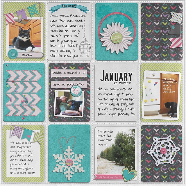
At the beginning of this year (which was incredibly hard because we lost our beloved baby kitten, Revan, who was like a child to us...), I decided to tackle a year long project on my terms about every day life: A one or two pager round up on our month. I originally tried forced myself to do the pocket thing again and created a page reviewing the things I'm not going to pages for and doing something with those pictures I love, but aren't getting their own spread.

Here's January:

janinrview credits: Valorie Wibben Pockets No 3.; Meg's Creations Captured My Heart; The Lily Pad Winter Wishes; Fonts: Mom's Typewriter, SF Movie Poster, Pea Lopez.

Meh. It's not that awful, but nothing about it is at all me. Still, I'm keeping it because it's a reminder of exactly that- not me. 

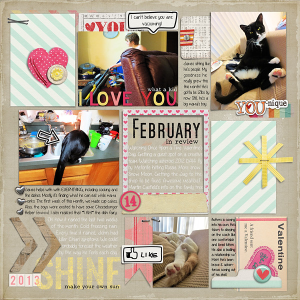
In February, I thought about my approach. Why not let the page come together organicallyTake the pocket idea and put my own twist on it


febinrevieww
credits: Micheline Martin someone to Love, Artsy Bits Valentines Day; Pink Reptile Designs Lucky in Love; Allison Pennington Playground Love, Decorated Polaroids; Sahlin Studio Key to My Heart, XOXO, Type Set Alpha. Fonts: Angelica Rose, SF Movie Poster, F25 Executive

This page came together so easily for me. Incredibly easy. It flowed. It has that PL/pocket page feel to it, but it's also fun and free spirited (like me!). 

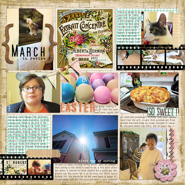
I did the same for March:


marchinrevieww
credits: Julie Kniepp A Slice of the Good Life; CD Mucosky Blessed Beyond Belief. Fonts: SF Movie Poster, Bohemian Typewriter, Yummy Cupcakes

Again, this page flowed and I really enjoyed creating it. That's the key. Don't create in a way you don't enjoy.

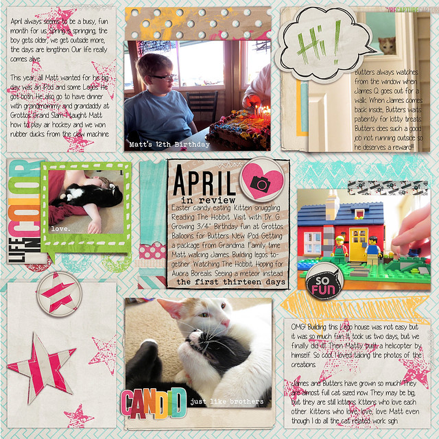
My April page I decided was going to be a two page spread. I was just super excited at this point and had a ton of photos to use. I've still got page two on my virtual desk, but I already love page one:


aprilinreviewpage1w2
credits: Just Jaimee April Storyteller Bundle. Fonts: SF Movie Poster, Yummy Cupcakes, Bohemian Typewriter

Not only do I love this page soooo much, I also loved the Storyteller kit. I realized that it married my project, my aesthetic and my process-- serendipitously! While I still have page two to do, I'm chomping on the bit to start May's page.


Tuesday, May 7, 2013

Zen of Digi: The digital pantry

After iNSD, all those new goodies left me feeling overwhelmed. The only cure for that was to purge and organize. (yeah, I said purge...) Everyone has some sort of system for organization-- even no organization is a system because your computer is going to alphabetize files by default.

Organization is such a big topic in digi land and you could probably spend more time reading about it than actually doing it. I love the idea of tagging colors and element types and such-- it really seems like a good idea in theory-- BUT a system is not going to work if you don't have the time to do it regularly. Personally, I know I wouldn't tag regularly. I also know that if I'm going to devote time tagging, it's more important to me to tag photos. So, I'm gonna show you what I do to keep things easy to find and manageable so I can actually make some layouts.

I am a total kit scrapper, so my system works for me as a kit scrapper. I'm pretty sure it doesn't get much simpler than this, either. I do believe that everyone can have a system that flows for them.

Now, I keep all my supplies on an external hard drive. My family uses it, too, but mostly for swapping photos and files (we can stream other media on our 4 gaming consoles):


If I click on my 'digi scrap; folder, here's what I see: 


The first file is aptly named and because Windows sorts folders and files numerically first then alphabetically, when I want a folder to come first, I make '1' the first character in the name. In this directory, I have my projects-- so all that projects layered files, print size, web size and photos are neatly kept together. That makes working on a specific project simple a pie. I also have a couple back ups of my Paint Shop Pro files, which is handy every time I upgrade. Then I have my supplies (and it says overflow because I was storing them on a USB, but that worked out dreadfully... and I never changed the file name... and it's not a big deal). Then I have my hoarded kits-- the ones I can't delete, but will never use again. The 'scrapping' folder has all my layered files, print quality LOs,  LOs that have been printed, gallery size LO and such. Umzipped (should be unzipped-- oh well) is a copy of all my original zipped kits.

I may clean up these files either never, sometimes or once a month. The great thing is it really isn't a huge deal because either the organizing happens organically while I work or once a month when I download my membership kits.

Note the random images. These are things I've printed for my family and maybe I'll do something with them later, maybe not. No biggie.

The Supplies


Here's my Digi Scrap Supplies Overflow folder all opened up. You see how I have the two themes at the beginning of the list? Thank goodness for the number 1!! Those are the only themed kits that I know I'm not going to use for everyday scrapping. Again, that's just me. Not everyone will use a Valentine's kit for a birthday page. haha!

Then I have previews, which I thought I'd make part of my system, but it turned out I'm not into doing it regularly... I'll delete it one day. After that, The Digi Files... but even now I'm considering pulling all those kits out. I feel like I miss them when I want to pull supplies from my stash.

Lastly you can see the rest of the stuff is in alphabetical order. And there are multiple folders for one kit. Why? Because after I unzip, I wanna play. It just fits my process. I don't feel the need to change the way the designer named their folders unless the designer just named their folders 'elements' or 'papers' (designers, please don't do that).

But what about collabs? You can see A5D (After 5 Designs... miss them) up there, right? That's a store collab and it's all there. Same with the PCO (Pixels & Company) below. Having the pieces of the collab minimizes the folder load time when I click on it, just like it minimizes download times.  If it's ain't broke...

Now sometimes designers make a collab together, but don't put the designer they're working with in their file names. How do I handle that? Well, glad you asked. I make a folder for the entire collab with both designers names like this:


See? Sahlin Studio and Sugarplum Paperie didn't credit each other in the file name, so I just made them their own folder. Since it doesn't happen often, it is easy peasy. For build your own collab type kits, if I buy a lot of product that line, I'll make it's own folder with store initials, line name, month and year, ie: TLP_BOYC_FEB_2013. Cake.

There you have it. My simple system. I think the trick is is to do what fits work scrapping process. Do what's simplest and just do it. If you feel all "ugh, I don't wanna but I gotta" then your system isn't working for you. As you evolve as scrapper, you may need to evolve your organization, but for now, live in the present of who you are and what you do. The rest will follow. That's the art of Digi Zen.

Monday, May 6, 2013

Time to dust things off...

It's been awhile! I'm going to pretty things up and get back to talking about wonderful scrap things. It's time. It's really time. The family is in a good place, we're a up a couple of kittens and Spring has sprung.

In the meantime, I'll leave you with something I'm currently in love with: Washi Tape.

Washi Washi Bing Bong!! (that's what we say in my house)

This layout was whipped up for an iNSD challenge at The (dash) Lily Pad. I've been wanting to make a washi background for photos for awhile and what better time to bite the bullet for a challenge? And while this page made quickly and needs a few tweaks before printing, I still love it. It really does sum up the fun I had this iNSD.

credits: just jaime nonsense, my digital obsession paper pack, sara gleason birch tree,
valorie wibbens sprinkles v. 15, (arrows drawn by me)
fonts: out of tune, orator std


In other news, I've started a new monthly documenting project that is similar to Project Life, but is do-able in my own crazy life. I'm so in love with it and am finishing up April this week. I am over the moon with this project, so I'll be sharing it soon... 

Now, off to do some e-spring cleaning.